Your site’s logo is part of your business’ brand. It is what people use to easily identify your business. It is part of what makes your business unique. It is a visual that people can easily identify and relate to.
A lot goes into coming up with a great logo, for example, defining what it represents and whether it is in line with the brand’s products, services or company values/culture. An important aspect to consider is displaying the correct logo sizing on your digital assets, like your website.
Your logo needs to be the recommended size. It should not be so small that it becomes stretched, and not too big to appear oversized. This way, your site will look neat and professional. Moreover, it will not take away space that could be used to achieve a better user experience.
In this article, we explore what the normal site logo size range is, default sizes across the popular web and social platforms, the average size on popular sites, and come up with a how to decide on the ideal size.
Overview of logo concepts
Below are a few things you and your business need to remember to design a professional logo:
- Logos are measured in pixels, for example, 1200 x 630 px.
- Vector files are the best, as they are easy to work with. You can convert them to any file format that you need — for example, FPGs and PNGs.
- Vertical, horizontal, and square versions of your logo are good to have. These variations allow you to place your logo wherever you see fit; for example, a backdrop, T-shirt, billboard, website, or business card.
- Consider using a PNG file to display your logo online that’s less than 200KB. PNG files are fast to load and always maintain their sharpness. Additionally, PNG files are lossless compressed files. They are able to maintain a lot of quality, even when compressed to small file sizes. Not to mention that PNG files allow transparent backgrounds and are suitable for websites, social media, and other web uses.
- A business brand guidelines document outlines where and how a logo can be displayed, and at what file dimensions. Basically, a brand guideline allows a brand to remain consistent across all communications.
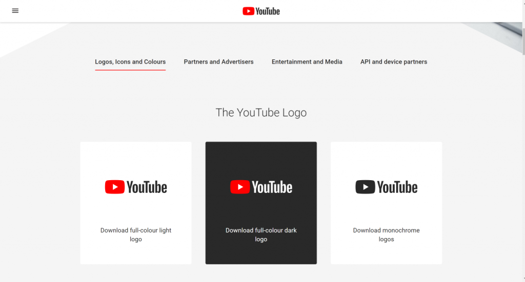
Here’s an example of YouTube Brand Resource section to help their users follow their guidelines:
Note that the minimum logo dimensions for the web should not be below 24px in height, and not be above half of the screen size.
Standard website logo sizes
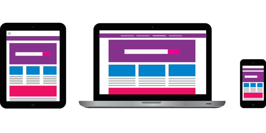
Logo size not only refers to the width and height of the logo, but also to its shape and orientation. You need to make sure that your logo is versatile, scalable, and proportional so that you can use it on different platforms and places on your site. Screen size is also another consideration to make as your logo still needs to remain crisp even on smaller screens (tablets, smartphones, smartwatches).
Logo size best practices
Since you are going to be using your logo on various platforms or even places on your site, for example in your header, footer, and favicon, you need to take care of its legibility. Here are the best practices to achieve legibility no matter the platform or location on your site.
- Go for a png format
- Go for a smaller logo
- Have your logo in vector format
- Keep your logo file size under 100KB
- Have a horizontal, vertical and square version
- Have different color versions - black, white, and full color
- Use an appropriate format for the platform that you are using
- Go for size consistency. A brand guideline document will come in handy here.
The normal site logo range is between 250 x 100px and 400px X 100px for a horizontal logo, and 160px X 160 px for a vertical one. There are other schools of thought that recommend smaller logo sizes (less than 100px) as the ideal.
If you are going to include your logo in your header, then a height of 20px to 30 px is best.
Default site logo size on various platforms
What should be the ideal logo size on Content Management Systems (CMSs) and website builders like WordPress, Shopify, Wix, and Squarespace? Let’s explore that below:
Wordpress
On WordPress, logo size depends on the theme that you are using. For example, if you are using the Divi theme, the default size is 93px X 43 px. When uploading, go for a 250px X 45px to 250px X 55px size for a horizontal logo. This way, there will be enough white space around the logo making it look crisp.
Squarespace
On Squarespace, the logo size is really determined by the image size that you upload. It is possible to change the height in some templates. If you are not sure how your template displays logos, go for a larger image, as a smaller image will lose legibility and quality when stretched. Squarespace allows for .gif, .or, .png and .jpg formats. This article shows Squarespace logo sizes for different templates. The Bedford theme allows for logos with a maximum width of 100px on desktop.
Shopify
Most themes on Shopify have guidelines for maximum height and width when it comes to logo sizes. For example, the Parallax theme’s maximum logo size is 410px X 205px. Make sure that the logo size that you upload is within these two dimensions.
Wix
Wix recommends the use of the .png format when it comes to logos. The image should have an aspect ratio of 1:1, which is a square image. The recommended size is a minimum of 3000px X 3000px.
Examples of logo size on popular websites
What logo sizes do popular sites use? Let’s explore further below:
Nasa
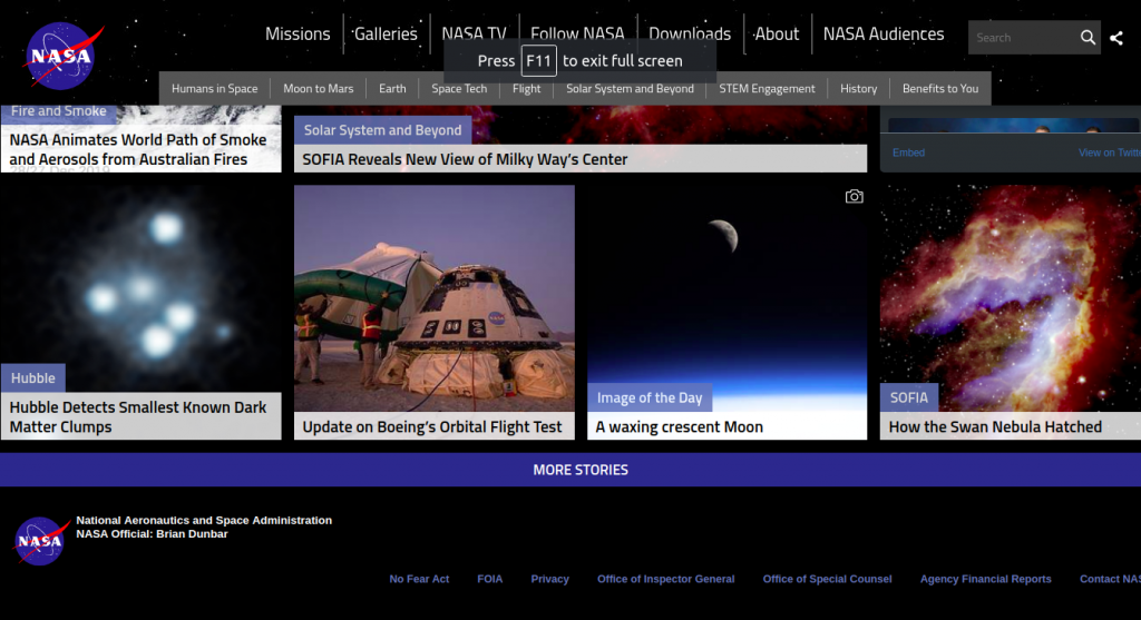
Nasa’s logo size is 110px X 92 px. It is in .svg format. It is used within the navigation bar and footer.
Trip Advisor
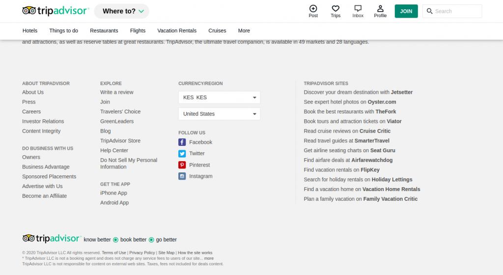
Trip Advisor’s logo size is 250px X 38px. It is used in both the header and the footer and it is in .svg format.
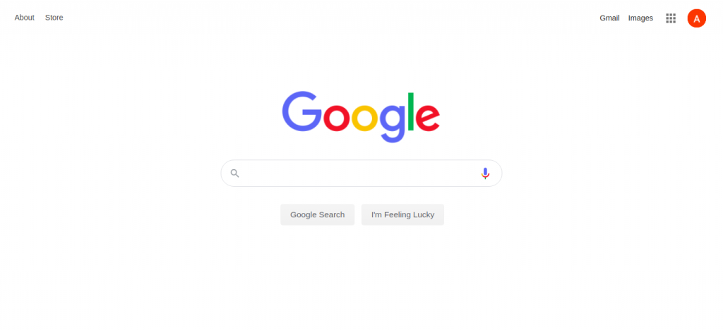
Google’s logo is uniquely located. Unlike other logos that are usually located on the top left and bottom left, Google’s logo is located at the center of the webpage. Its size is 272px X 92px and it is in .png format.
Now to help you understand and decide which logo sizes are suitable for you, below, we present to you seven web designs. We have categorized the designs into three categories:
- Large logo web designs
- Medium logo designs
- And small logo web designs
Examples of logo size from different websites
Large logo web designs
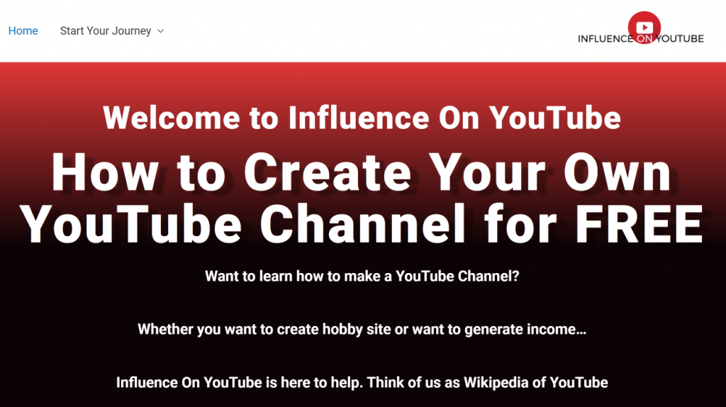
One site that uses large logos is Influence on YouTube (235px by 64px). The logo itself is medium-sized positioned on the right corner. It’s largely because the YouTube logo is on top and the words are at the bottom.
Influence on YouTube has done an excellent job of focusing on the main message while still making sure everything feels branded. See the images below for more information.
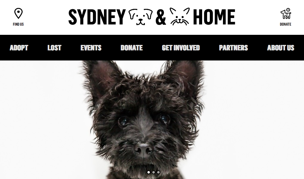
Last in our list of large logos, is Sydney Dogs and Cats Home (391px by 56px). This website centers the logo on top of the main navigation. This means any person visiting the site will see that logo at first glance and get the message you want to pass with your emblem.
Medium logo web designs
If super-big logos don’t work for you, then you can try medium logo web designs. Medium logos are about 300 px wide * 75 px tall unlike large logos which are something like 1000 px wide and 200 px tall.
Medium logos stacks elements for a taller layout.
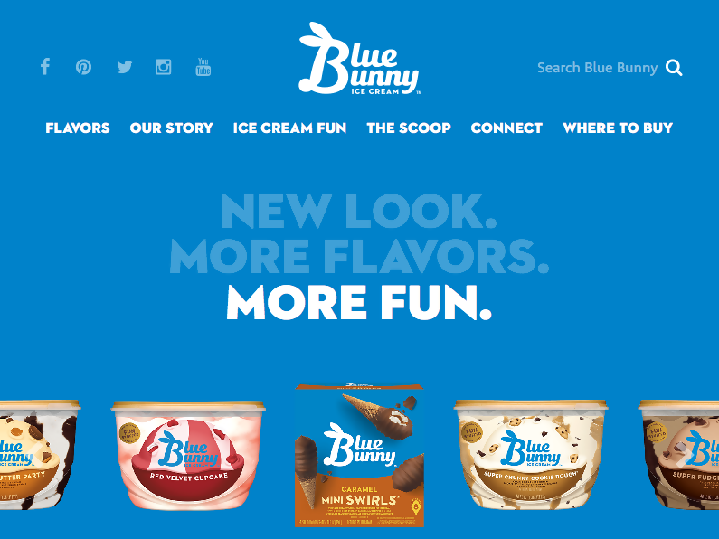
Blue Bunny logo (109px by 64px) has stacked the word “blue” and “bunny” with the stylized B to come up with a beautiful logo. See the image below for more information.
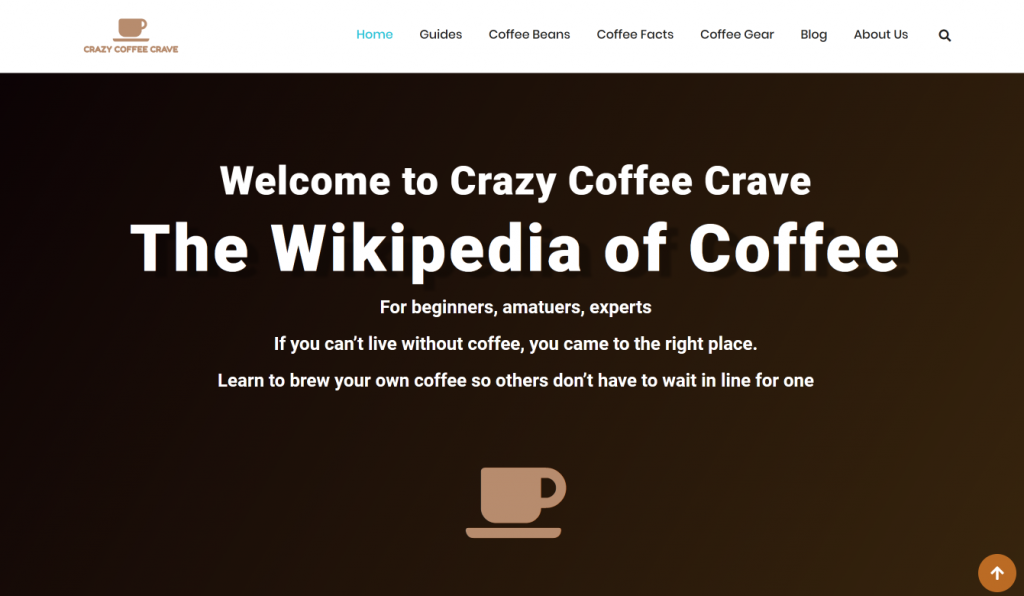
Crazy Coffee Crave (120px by 61.8px) is yet another brand with a medium-size logo. The brand has the coffee cup with the words crazy coffee crave on their logo and in the middle of the header, you have a coffee cup. Have a look at the image below for more details.
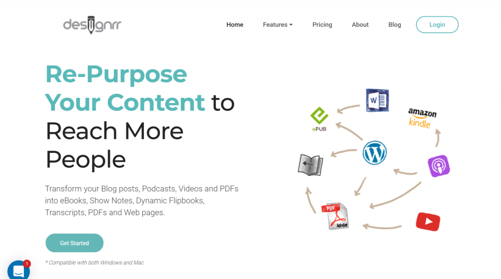
Designrr’s logo (190px by 60px) is still considered a medium-sized logo. Though the logo looks smaller, compared to the others mentioned above. The design focuses on content and creation. See it below.
Small logo design
By now you understand what we mean when we talk about large and medium logo designs. Let’s have a look at the tiny logos. You have probably seen many of them. If not, the two examples below will help you understand what small logos look like.
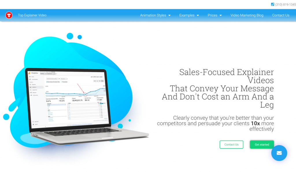
Top explainers is using their favicon icon for their logo, so it’s considered a small logo design, 40px by 40px. It definitely helps identify their brand across the board.
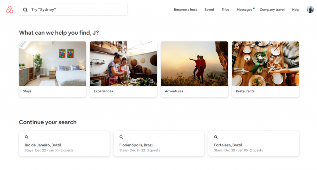
What about big name websites like Airbnb (76px by 76px), YouTube? Looks like Airbnb opted for their logo with no words compared to YouTube
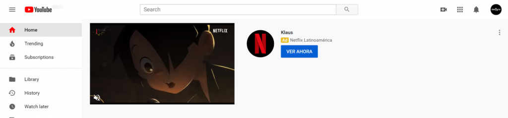
YouTube (80px by 24px) is sticking to using their YouTube logo and name on their website.
Uber (50px by 17px) wraps up our list of web designs examples that will help you decide which logo size is ideal. Uber logo is small but does all the heavy lifting. Just seeing the logo reminds of the luxurious rides, friendly drivers, and excellent services.
Using a logo in your website header
Most businesses display logos on the left side of the top navigation bar hence leaving enough space to display all pages of the website. A good number of website builders like Weebly and Squarespace make it easier to place logos on the left side. Additionally, a website builder can help you decide the size of the logo to design. Basically, website makers can make your work easier when contemplating building a fit logo.
Logo sizes for print
The format of your logo is what matters most when it comes to printing. Vector formats such as PDF, SVG, and EPS are preferred for printing over raster. By why vector formats? This is because it is easy to edit them and retain quality when scaled up multiple times. For example, you can scale a vector logo multiple times, yet the quality of the logo remains the same. Additionally, you can edit such as a logo (the entire image and its separate parts) effortlessly.
That said, we recommend that you use a 500+ px logo for small print and a 1024+ px for large print.
Logo sizes for social media
Making sure your logo displays correctly across different social media platforms is very crucial. You want to make sure, at first glance, your customers can discern what your corporate image is saying. The good news is, your logo can display correctly across all platforms if you stick to the right dimensions.
Below is a break down of the basics that will help you get started:
Logo dimensions on Instagram:
Profile photo (circular): 110 x 110px
Logo dimensions on Facebook:
Profile photo (square): 160 х 160px
Cover photo: 1640 x 624px
Logo dimensions on YouTube:
Profile photo (circular): 800 x 800px
Thumbnail photo: 1280 x 720px
Cover photo: 2560 x 1440px
Logo dimensions on Twitter:
Profile photo (circular): 400 x 400px
Cover photo: 1500 х 1500px
Logo dimensions on LinkedIn:
Profile photo (circular): 400 х 400 px
Cover photo: 646 x 220px
Logo dimensions on Pinterest:
Profile photo (circular): 165 x 165px
When posting on social, it’s best to use PNG files, as they’re a lossless compressed format. Similar exports like JPG files are lossy compressed.
Lossy compressed files become pixelated or soft once compressed; hence, not the best option.
Changing the size of your logo
It is possible to change the size of your logo. How?
- You can use image editors like Photoshop
- Use online logo makers like Logaster
- Or hire a freelance designer
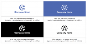
Logo variations and lockups
A logo variation is a modified version of your logo that you use in specific instances. Logo variations increase the versatility of where and how your brand can be displayed. For example, the logo you print on your T-shirts may vary from that you have on your Facebook though they all represent your company.
What types of logo variations are we talking about?
Color variations: Black, white, inverse, full color/multi-variations of color, or transparent background
Wordmark and symbol variations (also called logo lockups): Full logo, a logo with slogan, logo without a slogan, symbol, logotype/wordmark, or monogram. See the image below for more information.
In conclusion
Large logos might not be the right fit for your web design. It can be a distraction or it can blend in, the logo’s main purpose is to help users know that they are on the right website. Most well-established websites stick to a moderate sized logo, think Uber, simple and blends right in.
If your logo is tall or big, you might want to consider using a single letter or acronym to help. Think Blue Bunny, using the letter “B” to put together two words together. It would be better to have the letter “B” as their main logo and on their website they can mention Blue Bunny. If your logo is small then make sure that it can be read or easily recognized.